Controls
I've designed the game for the PC, so I have keyboard and mouse controls in mind. The layout has to be done carefully for players to control multiple units simultaneously with precision. There are two layouts that I'm considering.
Control Layout 1
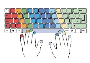
Unit control per column. This style assigns control to the units per finger, based on the natural layout of the hand. As such, the pinky controls Unit 1, ring finger controls Unit 2, etc. The most commonly pressed buttons would be the 1234 keys, which is standard for PC games. The fingers mostly rest on the 1234 keys, which would make it easy to the QWER keys. The skills would be designed with long cooldowns so that large movement to the ASDF and ZXCV would be irregular.
The mouse control adds another dimension of skill to the game. Some genres are able to function exclusively on button presses. But genres in FPS and MOBAs require a different skillset of hand-eye coordination and accuracy to control the mouse. These games tend to have the highest skill-ceiling due to this aspect.
User Interface
 To manage four independent units simultaneously, the control and UI needs to be very intuitive. Excess data can be quite confusing and distracting. The data displayed has to be valuable and provide the player with the minimum that they need. I dislike games that are too complex in their menus, but I also dislike games that are too cryptic.

I'm currently designing around Layout 1. The UI is presented to replicate the layout of the keyboard, which should make the control of each unit feel natural. Each unit will have their healthbar displayed both in the static windows and hovering above their sprites. The unit number near each healthbar helps identify which unit to select. This is essential since each unit could be anywhere on the screen; not just in the 1-2-3-4 order.
| Unit 1 | Unit 2 | Unit 3 | Unit 4 | |
| Select | 1 | 2 | 3 | 4 |
| Skill 1 | Q | W | E | R |
| Skill 2 | A | S | D | F |
| Skill 3 | Z | X | C | V |
Control Layout 2
Unit control per row. This style assigns the control of each function per finger. The pinky finger would be used for selecting movement across the units, the ring finger for using Skill 1 across the units, etc.
This one doesn't sound as natural, since this would require the pinky for using the "Select" keybind. This would be unusual since most PC games just have the pinky finger resting on the Shift or Ctrl key. Even in normal typing, the pinky isn't used too often. I just tested it out now; when I type "Q" or "1" I just use my ring finger.

And pairing with the keyboard would be the mouse, used for clicking around on targets and locations. The UI buttons should make it so the entire game could be played by using the mouse to click on everything. But it would be more optimal to become comfortable with the the keyboard.This one doesn't sound as natural, since this would require the pinky for using the "Select" keybind. This would be unusual since most PC games just have the pinky finger resting on the Shift or Ctrl key. Even in normal typing, the pinky isn't used too often. I just tested it out now; when I type "Q" or "1" I just use my ring finger.
| Unit 1 | Unit 2 | Unit 3 | Unit 4 | |
| Select | 1 | Q | A | Z |
| Skill 1 | 2 | W | S | X |
| Skill 2 | 3 | E | D | C |
| Skill 3 | 4 | R | F | V |
Mouse
The mouse control adds another dimension of skill to the game. Some genres are able to function exclusively on button presses. But genres in FPS and MOBAs require a different skillset of hand-eye coordination and accuracy to control the mouse. These games tend to have the highest skill-ceiling due to this aspect.
User Interface
I'm currently designing around Layout 1. The UI is presented to replicate the layout of the keyboard, which should make the control of each unit feel natural. Each unit will have their healthbar displayed both in the static windows and hovering above their sprites. The unit number near each healthbar helps identify which unit to select. This is essential since each unit could be anywhere on the screen; not just in the 1-2-3-4 order.
Comments
Post a Comment